12 Oct How the Right Website Hero Image Connects Your Brand with Your Audience
You know what they say about first impressions, right? When you’re facing constant competition for the eyes, hearts, and minds of your potential customers, your website needs a hero image that creates an instant connection. Let’s discuss how the right website hero image connects your brand with your audience so you can earn their trust and, eventually, win their business.
What Is a Hero Image?
A hero image is a large banner image at the top of a web page, often extending the full width of the page. Your hero image can be a photo, graphic, illustration, video, or animation. It can be a static image, a carousel controlled by the user, or an automated slider. It can include text, such as a tag line, positioning statement, or product name, as well as a linked button with a call-to-action that directs the user to the next step on their journey.
The type of website hero image you choose depends on the products or services you offer, the feeling you are trying to evoke, and what you’re trying to accomplish.
For example, an elder care law firm might use a photo or video that shows one of their attorneys interacting with a client who fits their target demographic. This type of hero image would begin to overcome anxiety and build trust with a potential client.
A custom cabinet maker could use the hero image to showcase their unique designs, features, and finishes that really differentiate them from their competition. In this case, the best way to convey the craftmanship and the quality of their work is to show real-world examples.
Why Your Website’s Hero Images Are Important
When someone visits your website, especially the home page, a hero image stands front and center, commanding the attention of the user. Within a fraction of second, people are already forming an opinion of your company. That all-important first impression – how someone feels about your company – is driven in large part by your hero image.
The right hero image can draw people in and make them more interested in what you’re offering. The wrong hero image can have the opposite effect.
Examples of Different Types of Website Hero Images
Below are six websites created by Elwood Studio that show different types of hero images and the strategic purpose and approach for each.
 Flahive Mueller Attorneys at Law. This website uses a static image with a beautiful skyline photo of Trenton, NJ where the state capital and courthouse are located, as well as text that concisely explains their area of focus.
 Empathetic Mentoring. This is a prime example of how video (of the target audience) can be used to create interest and direct the user to the positioning statement and call-to-action, which directs the user to schedule an appointment.
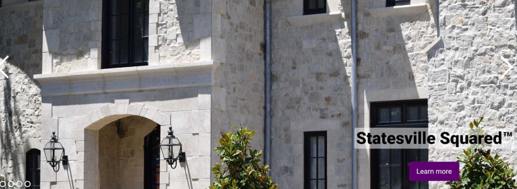 Natural Stone Solutions. Using a carousel of photos that allows the user to browse at their own pace, this hero image highlights popular products as they appear on the properties of actual customers.
 Bridgewater Marble & Granite Works. A single, professional photo of a high-end kitchen can inspire the user to visualize how their own remodeled kitchen might look, while text explains that these beautiful products are affordable.
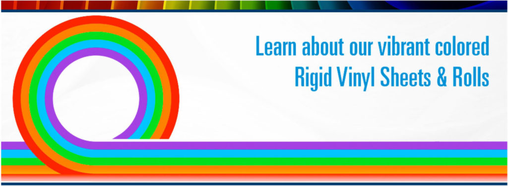 Kappus Plastic Company. The vibrant color options for various applications take center stage on this hero image, which uses a consistent design on each carousel image while showcasing different material options via a graphical representation.
 High Bridge Borough. An automated slider of colorful photos, including breathtaking aerial shots, shows the beauty of High Bridge Borough and conveys why people love to live and work there.
Are your website’s hero images grabbing the attention of your customers and prospects? Are you building a new website and not sure what type of hero image is best? We can show you how the right website hero image connects your brand with your audience.
Contact Elwood Studio for a free consultation!
Share...

Sorry, the comment form is closed at this time.